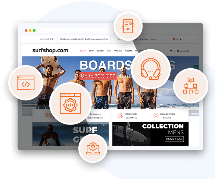
Certified Magento Design Partner employing UX/UI/CX design and creativity to bring stellar experiences to your customers.

Get Free 2-Hour Consultation!


Responsive web design
Built-in resize, adjustment and shrink controls so that your content looks fantastic regardless of the device

Store revamp / Facelift
Keep your online storefront looking fresh and modern with our contemporary designs

Custom template
Living by the standard can be tedious, why not make a design that goes above and beyond. Get a custom Magento Design!

Custom scripting
Use of innovative, custom scripts for both the Blueprint and Stencil themes

PSD to Magento Web Design
Already have a PSD design? We’ll convert it into html, and give your website a face

Graphic designing
Superior graphics for any situation. Bring your storefront to life with our vibrant designs

Custom item categories & mega menu
Different products need different catalogues and lists. Differentiate your store with custom layouts.

Customized blog
Blogs reflecting exactly how you want to engage and inform your customers

Custom Landing Pages
Make the best first impression with landing pages built to amaze and capture the attention

Custom gift certificates and email templates
Custom templates for marketing content through email, gift cards, documents and much more

Conversion Optimized
Conversion optimised website with intuitive UI and UX, built to land orders and leads

Search and Social Optimized
The design will be optimized to get you maximum visibility on search and social forums
Look through our portfolio and discover some of the best website designs Magento makes possible

Designs worth a medal
We have provided exemplary Magento design services for major players like SAP, Colgate, SquareTrade, AgriBeef, and many more.

Certified Magento Design Company
We bring you over a decade of e-commerce design and Magento development experience

No ‘no returns’ policy here
We are a service-focused Magento design company that offers a money-back guarantee because customer satisfaction is our priority.

Excellence in Magento Integration
Our team of experts is capable of design, development, and integration all with the same level of expertise.

Superior Magento Stencil Skills
No one knows the Magento stencil framework better than we do. We create websites that will make your customers go wow!

Digital Transformation Experts
We understand your design, development as well as marketing needs. Our experts know what works best for your customers as well as the search engines.
Folio3 is a specialist Magento web design company that focuses on providing customised e-commerce solutions supported by some of the best Magento SEO services. With over a decade of experience deploying superior Magento services, we have seen it all. Regardless of whether you want custom designs, features or even integration, we know what it takes to make your Magento website succeed. Explore the list below for more details:


Here are just some of the ways that we stand out as a company when it comes to our experience with Magento and creating awe-inspiring customer-centric experiences.
We’ve delivered Solutions to Enterprises & startups with 100% Satisfaction rate.


Frequently Asked Questions
This is a Magento eCommerce web design customized specifically to your requirements. Magento and other developers offer eye-pleasing Magento store design themes that can be instantly installed on your website to change the look and feel of your store. However, ready-made themes lack personalization, and the look and feel that you had in mind for your store. They also just cater to the basic categories and not any pages you may wish to add. That’s where custom Magento design comes in. This is where you hire a Magento design agency to develop a tailor-made store design for you that fits all your requirements for the look and functionality of your eCommerce website.
The best Magento website design company would be one that is known for making innovative and appealing Magento store designs. It would also be one that fulfills all the requirements of the store owners, whether they’re UI/UX based or functionality based. Moreover it would have an impressive Magento portfolio and clients who are all praises. The best Magento design agency for you would be one that has the experience and knowledge relevant to your industry and one that can take care of your requirements and give you exactly what you need.
Folio3 has been in business for more than the past 15 years with a multitude of clients of different sizes, from startups to Fortune 500 companies. It also has a grand impressive portfolio, and the most loyal and satisfied client base. This is why Folio3 is rated as a top Magento design company. Folio3 also has experience across most of the world and across all industries. There is no doubt that it would be your best bet.
On average, a Magento web design agency takes around $20 to $200 dollars per hour. However, in order to estimate your own Magento website design cost, you first have to take certain things into consideration. You have to factor in the features and functionality you would want in your eCommerce store. Even the level of complexity in your required features would play a role in determining the cost. You also have to take into account the amount of customization you would need.
When you are searching for the perfect platform for your eCommerce website design, Magento is often the first to come to mind. This is because Magento can give you an edge over other platforms in various ways.
Firstly it is an open-source platform that provides your developers with extreme flexibility to customize and add to the source code to make your website exactly as you want. It also comes with rich features and functionality and is highly scalable, from very small to giant enterprises.
It is also known as the most secure platform and has very few possibilities to get hacked. Also it is known to have the best SEO features and enables multiple stores, multiple languages, and also multiple currency payments all under a single installation.
Moreover, it’s known to offer the best performance and speed also for delivering one of the most mobile-friendly website experiences. Lastly Magento has made a name for itself with its huge number of extensions and the easiest third-party integration tools. Choosing Magento eCommerce web design services will be the best decision you make.


3080 Yonge Street, Suite 6060, Toronto, Ontario M4N 3N1
Amado Nervo #2200, Edificio Esfera 1 piso 4, Col. Jardines del Sol, CP. 45050, Zapopan, Jalisco, Mexico
C/- Prime Partners Level 4 1 James Place, NORTH SYDNEY New South Wales 2060
160 Bovet Road, Suite # 101, San Mateo,
CA 94402 USA
6701 Koll Center Parkway, #250 Pleasanton, CA 94566
Tel: +1 (408) 412-3813
Export House, Cawsey Way, Woking, Surrey, GU21 6QX
Tel: +44 (0) 14 8339 7625
Folio3 FZ LLC, UAE, Dubai Internet City,
1st Floor, Building Number 14, Premises 105, Dubai, UAE
Tel: +971 04 2505173
49 Bacho Kiro Street, Sofia 1000, Bulgaria
Folio3 Pvt. Ltd, Folio3 Tower, Plot 26, Block B,
SMCH Society, Main Shahrah-e-Faisal, Karachi.
Tel: +92-21-3432 3721-4
First Floor, Blue Mall 8-R, MM Alam Road Gulberg III, Lahore
Corporate 7 by Maaksons, Executive Block, Civic Center 1, Gulberg Green, Islamabad
Tel: 0333 5657425

Set up your Shopify MCP with Folio3.

Get Lifetime Magento Updates with Folio3